0.itemzero Case Study
Service: Type Design, Font Engineering
Client: Spaceship.com
Spaceship Sans
Custom Typeface
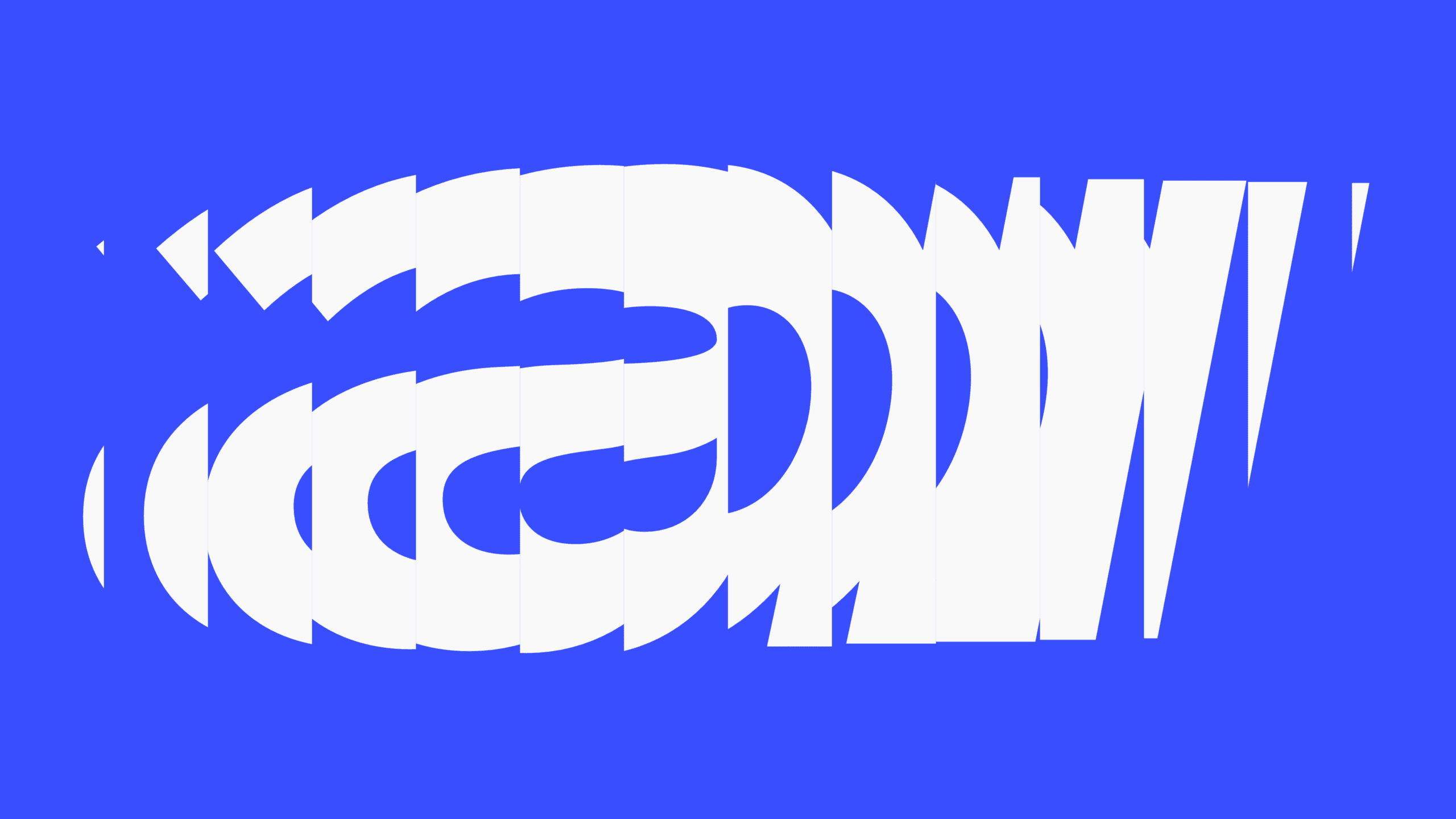
Spaceship Sans is a type family commissioned by Spaceship, Inc as their brand’s typeface.
Built from the ground-up to be seamlessly implemented across their wide range of apps, webapps and graphic materials.
It supports 700+ languages across Latin and Cyrillic scripts.
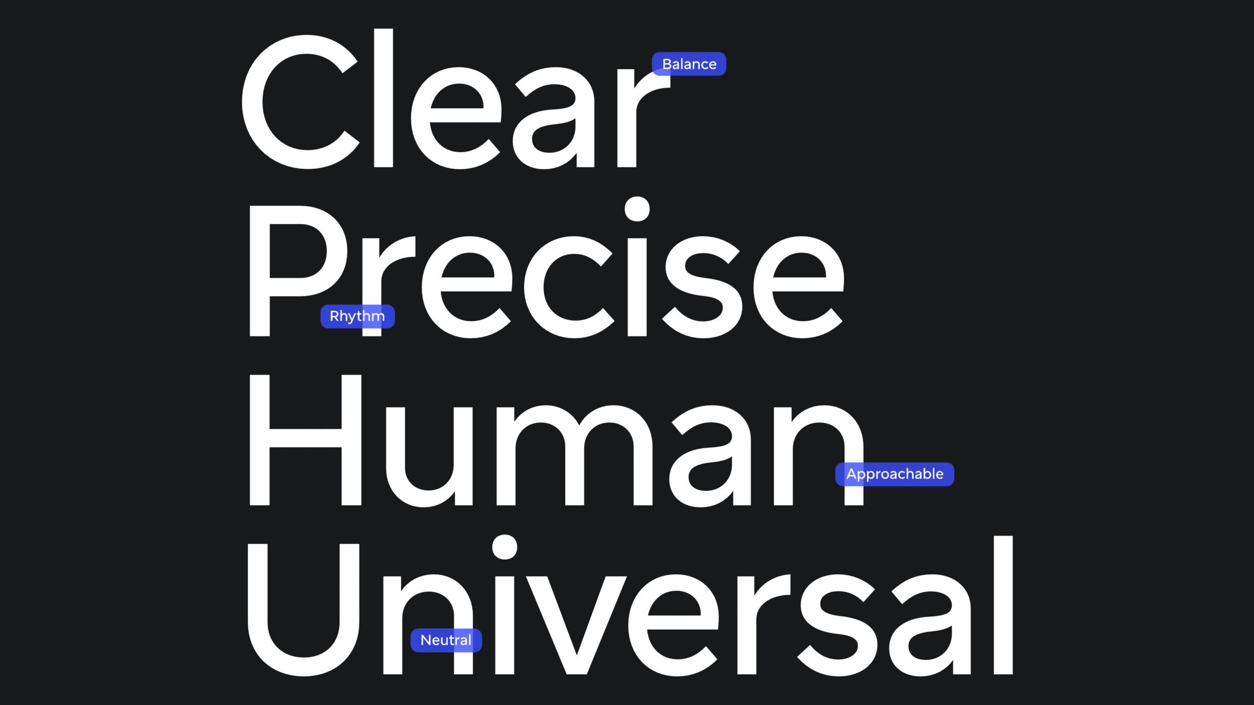
Credit: Spaceship.design
Brief
There is a special kind of pleasure in creating something to make others’ vision come to life.
Spaceship’s design team approached us in late 2024 with a set goal on their minds: to develop their signature typeface with us, from the ground-up.
From the get-go, they wanted to be part of the process, especially ideation — their wish was to do this project with us, together.
And this exactly the kind of dynamic we love.
Above: Timelapse of letterform iterations during Discovery.
Discovery & Ideation
Some parameters were set right from the start by Spaceship’s team: sans-serif, with mid-twentieth century European rationale of being unobtrusive, but human, approachable.
It should fit their technical stack without many hiccups — refactoring to make a typeface work was a big no-no, so we would have to tailor everything to their existing (and very, very extensive) work.
Moreover, Spaceship does an amazing job at documenting their design system: you should really have a look.
Stylistically, a chimera of paradoxes: half grotesque, half geometric, mechanical/technical, but human. Objective, but warm.
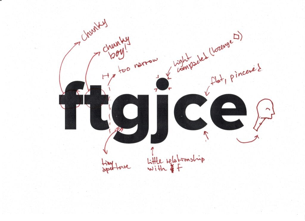
Above: Excerpt from the first analysis round.
We started by analyzing the typeface that Spaceship.com was already using: Mark Simonson‘s wildly successful Proxima Nova.
The goal of this analysis was two-fold: to identify what made them chose Proxima Nova to begin with, and to get a grasp on what and how to make a typeface that is more performant in Spaceship’s brand and ecosystem.
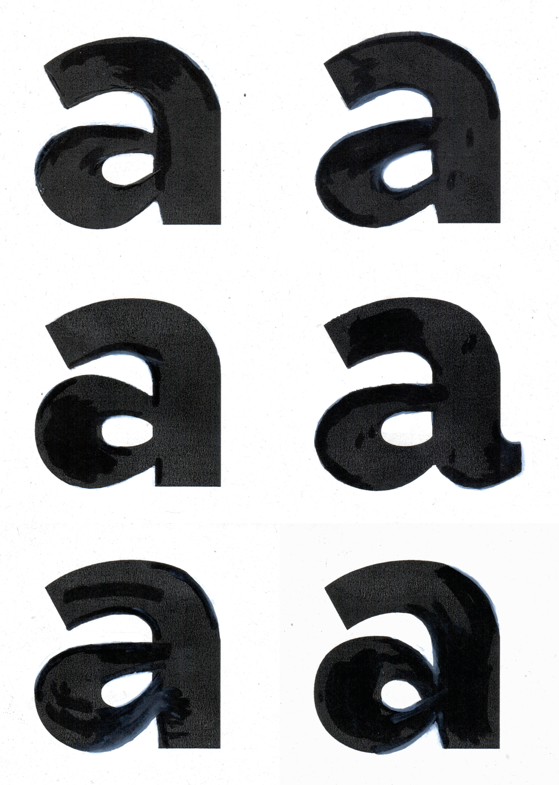
Above: Black and white ink sketches of initial ideations for the character “a”.
Ideation followed by borrowing the existing letterforms and reshaping them in pen and ink. This is a quick and dirty way to get our feet wet in the project, as well as to get quick feedback to narrow the amount of paths possible to trail.
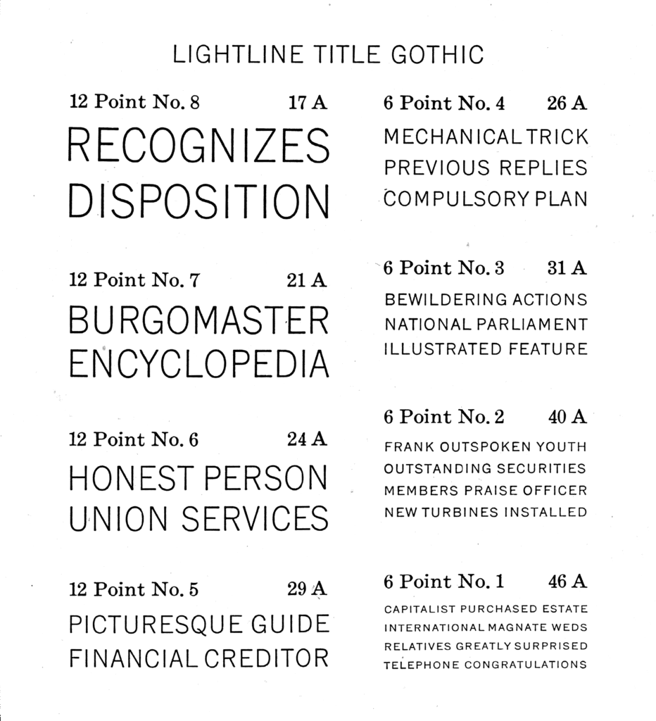
Above: American Type Founder’s Lightline Title Gothic, which ended up being an often consulted reference for the uppercase Latin letters.
Collecting specimens also played a big role in this stage, both as inspiration as well as targets for scrutiny.
Two main approaches were taken by both us and Spaceship to collect these references: how typefaces (especially bespoke ones) work in a branding context, and to glean what “vibes” we’re looking for from this act of collecting.
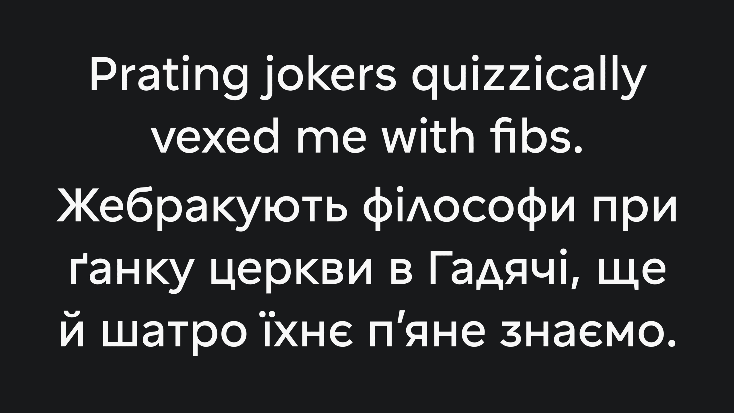
Regarding writing systems, Latin was the main tool for communicating formally with Spaceship’s team. Cyrillic, however, was developed at the same time, evolving along with the Latin forms.
The attitude taken while developing Cyrillic, however, was quite different from Latin: the former was informed by the choices made in the latter, while keeping the flavourful work of Ukrainian graphic artist Vasyl Krychevsky in mind.
For us, what made his work inspiring was the simple, rational but utterly playful construction of his letterforms.
Process & Iteration
This process of narrowing paths is considerably more convoluted than described here, but chaos, initially, is the whole point.
For us (both 0.itemzero and Spaceship) to be able to remove items from a pool of options we need, well, that pool of options. So, several approaches to form-making were experimented with.
At this point, references are tossed away to the realm of memory, and we started from (a now informed) scratch.
Sketching & Program
Both analogue (as we mentioned above) and digital sketching were used throughout this project.
Although this typeface’s program contemplates an existence that is mostly digital, analogue sketching has many advantages: it’s quick, lo-fi and involves less fighting with the tools and medium. The main advantage is its lo-finess: no one in the process gets too nit-picky about a curve’s tension or weight distribution and, for macro decisions, it’s perfect.
Digitally, two main approaches were involved: good old vector drawing in a font editor and, later discarded as an approach, pixel-drawing.
For the latter, we developed a little internal app (0.pixelFonter) to allow us quick sketching of pixel fonts.
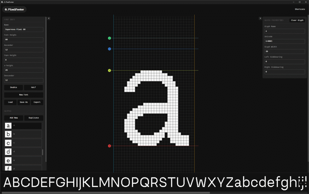
Above: Screenshot of 0.pixelFonter, the pixel font editor we developed for this project.
Overkill? Perhaps. But hey, it allowed us to prototype very quickly for this approach, we stumbled into some ideas that we liked and, well, we now have a pixel font editor to use in-house!
Manifesto
This whole process of making and dissecting a blob of variations made its way into the writing of a manifesto for the typeface. This is common practice inside Spaceship’s team.
The manifesto is a sort-of-poetic program for the typeface, a document of intention. This ended up being the most important reference for ideation: it provides a clear path on how the typeface should feel and carry itself, its voice, while remaining unconstrained regarding its shape.
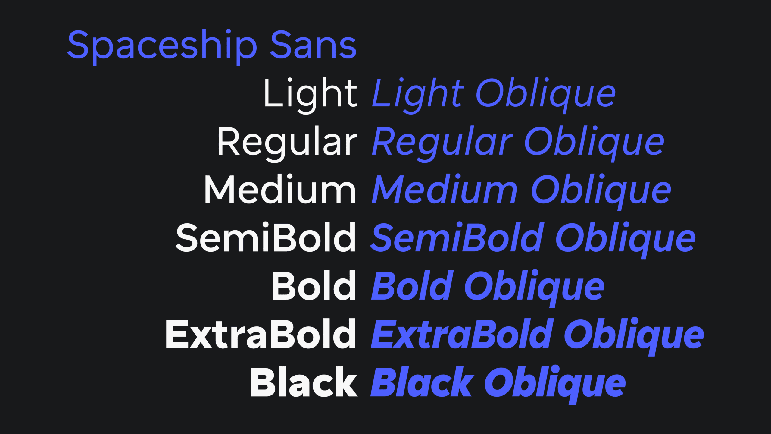
Above: Spaceship Sans’ cuts.
Spaceship Sans
So, what does all this amount to? 8,561 individual glyphs across 14 cuts, 7 weights and 2 styles. It supports 707 languages in both Latin and Cyrillic, which means that Spaceship Sans can talk to 7.7 billion speakers worldwide!
As for a more personal note, working with Spaceship’s team has been nothing short of amazing. They’re smart, professional and really good people. And if you go and have a look at what they do, that shows.